Public Transportation App redesign
(VVS) is a public transport association that coordinates Stuttgart’s entire regional transit network.

2024 Dec
Transportation App
Challenge
The existing VVS app, while offering real-time transit updates, failed to meet user expectations in terms of usability, consistency, and reliability.
Through user interviews, Google Play Store reviews.
Results
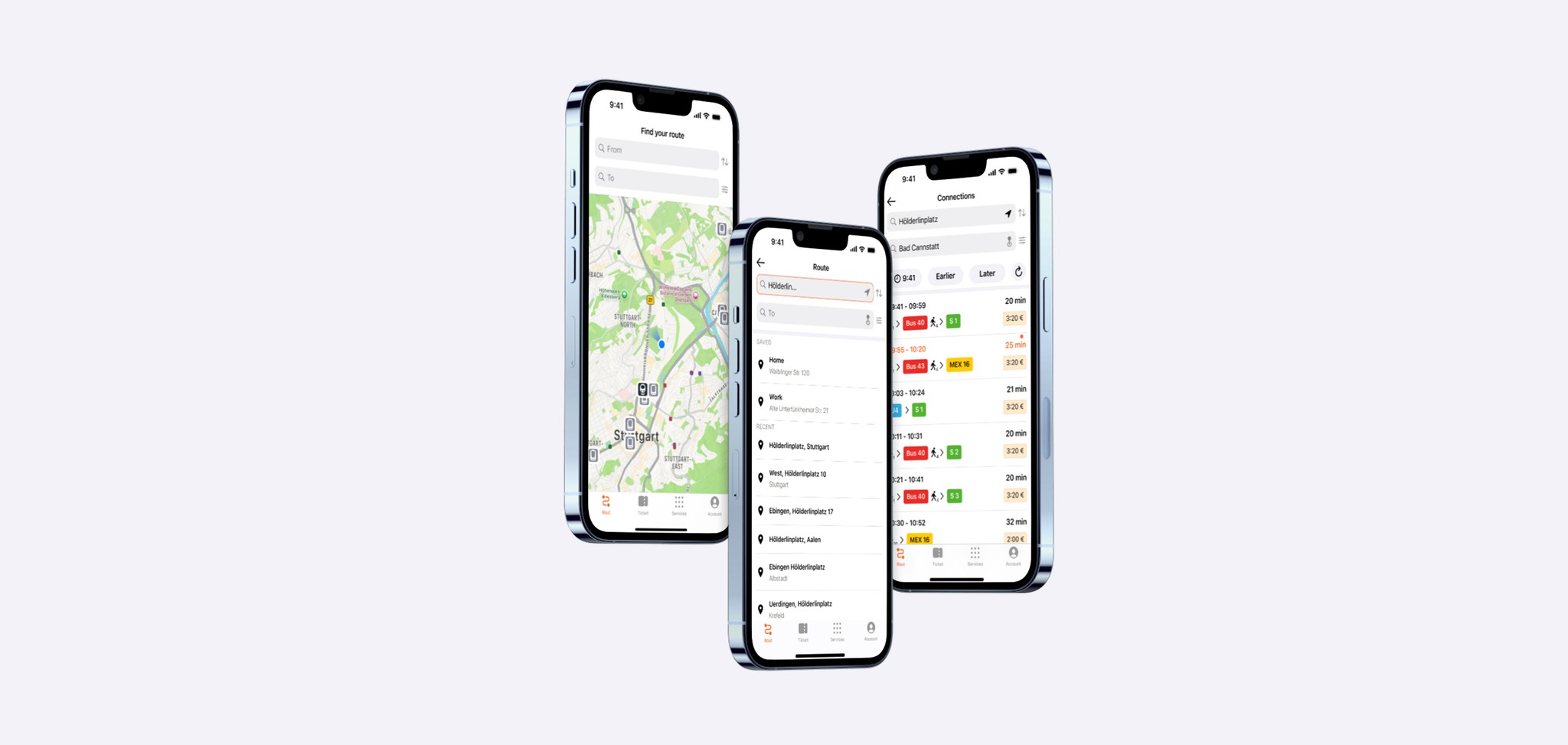
The redesigned VVS mobile app addresses these core pain points by introducing a cleaner, more intuitive experience.


Process
Define the Challenge: Users struggled to find rare beers, trust online freshness, and manage bulk orders easily.
Research & Insights:
Evaluated VVS Mobil's performance: Over 1 million downloads.
Ratings: 1.8/5 on Play Store (6,750 reviews) and 2.2/5 on App Store.
Common complaints: Unintuitive navigation, loss of active route, and limited map interaction.
Ideation & Structure:
Platform Number Visibility:
Long station names obscure platform numbers, causing confusion.Unclear Departure/Arrival Priorities:
The departure/arrival menu lacks visual hierarchy, making it hard for users to quickly identify essential information.Limited Map Interaction:
Users cannot tap directly on routes in the map, unlike in apps like Google Maps, reducing intuitive navigation.No Saved Routes:
The absence of a feature to save frequent routes (e.g., "Home ↔ Work") forces users to re-enter information repeatedly.Lack of Trip Continuity:
When switching between functions (e.g., checking tickets), the current route is lost, leading to repeated input and frustration.
Wireframing & Prototyping:
Sketched low/mid-fidelity wireframes
Built and tested interactive prototypes
Incorporated feedback from mentors and senior designers
Usability Testing & Iteration
Conducted tests with target users to test new features.
Refined UI elements, simplified filters, and improved route continuity.
Iterated based on feedback, resulting in increased user satisfaction.


Next Steps
Account Pages: Design and implement a structured account management system.
Ticket System Redesign: Simplify the 30+ ticket options into clear, manageable groups.
"Buy a Ticket for a Friend": Enable users to purchase and send tickets to non-tech-savvy visitors.
Station Info on Map: Allow users to tap on stations to view routes, transfers, and additional details.
Conclusion
This redesign concept improves core usability by streamlining navigation, showing platform numbers clearly, and prioritizing features like saved routes. While map interaction is still a conceptual idea needing more testing, the project lays a solid foundation for a more user-friendly and reliable transit app.

Full case study